Blogs
Sign-up to receive the latest articles related to the area of business excellence.
Overview of box plots
View All Blogs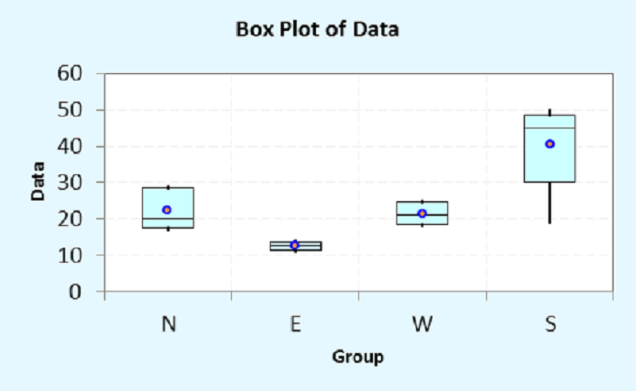
A box plot (also known as a box and whisker plot) can be used to graphically plot continuous data usually when the data is collected in groups. A box plot can be used to quickly compare different groups of data to obtain a quick idea about the central value and variation that is present in the data for each group. Unlike a dot plot or an individual value plot, each data point is not shown on a box plot but the data is summarized and shown as a box. The size of the box is drawn such that the middle 50% of the data fits inside the box with the bottom 25% of the data points lying below the box and the top 25% of the data points lying above the box. A line within the box shows where the median of the data points lie. The median value is the value where 50% of the data points lie below this line and 50% of the data points lie above the median. A whisker (or line) is drawn from the bottom of the box to the minimum value if the data points lie close to the box. However, if the data points lie too far away from the box (less than 1.5 times the size of the box), then the whisker is not drawn till the minimum value but to cover only data points that lie within 1.5 times the size of the box. Values that lie far away are shown by stars (*). Stars indicate the presence of outliers in the data set. Similarly, a whisker is drawn from the top of the box to the maximum value or till data points that lie within 1.5 times the size of the box.
How to create a box plot
Use the following steps to create the box plot:- Determine the first quartile (Q1), median (Q2), and third quartile (Q3) of the given data set.
- Draw a box between the first and third quartiles. Show the median by drawing a line within the box at Q2. If required, show the mean value by drawing a circle within the box.
- Determine the extreme values for the whiskers. The maximum value of the top whisker is W3 = Q3 + 1.5*(Q3-Q1). The minimum value of the bottom whisker is W1 = Q1-1.5*(Q3-Q1).
- If the remaining data points that are outside the box are less than W1, then draw a whisker from the bottom of the box (Q1) till the minimum value, otherwise, draw the whisker only to cover the data points between Q1 and W1. Any values that are less than W1 are shown as stars (*).
- If the data points that are outside the box are greater than W3, then draw a whisker from the top of the box (Q3) till the maximum value, otherwise, draw the whisker only to cover the data points between Q3 and W3. Any values that are greater than W3 are shown as stars (*).
- Repeat the above steps for each group of data points.
How to Interpret the Box Plot
For each group, first look at the median value. You can interpret this value similar to the mean value or the central location of your data points. You can see which group has a higher central value and which group has a lower central value.Second, for each group, determine the size of the box along with the whiskers. If the box and whiskers is thin then that data group has less variation and if the box and whisker is wide, then that group has more variation.
Third, for each group, determine if there are any outliers present in the data. If the outliers are present then you may want to investigate further to determine the cause of the outliers. This may provide clues on how to improve the process.
Finally, you can determine if the data points are symmetric if the median value (Q2) lies in the center of the box. If the median value (Q2) is closer to either Q1 or Q3 then we can conclude that data points are not symmetric.
Presence of outliers and/or non-symmetric data may indicate that the data set is not normal.
Example
Data was collected at a company for the time it takes to complete projects. This data was collected for four regions of the country (N, S, E, and W). Create a box plot and draw any conclusions as appropriate. The box plot shown in the article is for this data set.From the above figure, we can conclude that the projects in the eastern region of the country are completed the fastest with the least variation. The cycle time of projects in the southern region is the largest with the highest variation. The north and western regions lie somewhere in between and are pretty comparable to each other. There are not outliers in any of the regions. The data for the northern region and the southern region may not be symmetric.
Follow us on LinkedIn to get the latest posts & updates.
