Blogs
Sign-up to receive the latest articles related to the area of business excellence.
Histogram
View All Blogs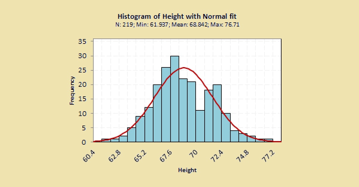
Introduction
A histogram is a graphical representation of data. It is used for continuous data when you want to determine the nature of distribution of the data. It gives you an idea of the central location of the data (roughly where the mean and median are located) and the amount of variation you have in your data (roughly the minimum and maximum values). By viewing the distribution of the data, you get an idea if the distribution is unimodal (has one peak), bimodal (has two peaks), or multimodal (has many peaks). It tells you if the distribution is symmetric or non-symmetric. If the distribution is not symmetric, does it have a long left tail or a long right tail? The shape of the distribution also gives you a clue if the distribution is close to a normal distribution or any other shape you may be interested in (such as uniform, exponential etc.) Hence, whenever you collect continuous data, it is always a good idea to plot the histogram which will give you more information about the nature of the data you have collected.How to build a histogram
Step 1: Determine the bins To construct a histogram, we first divide the data into “bins”. The bins are usually consecutive and non-overlapping intervals of equal size. There is no right or single way to determine the bin size. If the bin size is too large then the shape of histogram is not clearly shown a lot of bars of the histogram get grouped together. If the bin size is too small, then it is possible that no enough data points are available within each bin and you may find a lot of “gaps” or empty bins making it hard to visualize the shape of the histogram. Hence, we should always try to vary the size of the bin to see if our interpretation of the shape of the histogram is any different. If you know the number of bins (# bins) you want, you can determine the bin size simply by using the formula:
Usually, we do not know the number of bins in which case you can try one of the commonly used formulae which depends on the number of data points (n):

Step 2: Place the data in the bins Sort through the data and determine which bin it falls into. For each data that falls into a bin, increment the count by 1. For example, if the data is 1, 4, 3, 2, 5, 6, 3, 2, 4, 3, 2, 1 and the bins are as follows (bin size = 2), the following table is obtained at the end of placing all the data into bins.

At the end of the exercise, the sum of all the values in the frequency column should be equal to the number of data points you started off with. Step 3: Plot the histogram Plot the bins on the horizontal (or vertical axis) and the frequency on the vertical (or horizontal axis). Depending on your objective, you may also want to superimpose the shape of the histogram on the histogram of the raw data in order to compare the theoretical shape with the raw data.

Step 4: Interpret the data Once you have plotted the histogram, look for the following items:
- Minimum value of the data. From the above histogram it can be seen that the minimum value is roughly close to 0 (note that it may not be possible to get the exact minimum value from a histogram since we are binning the data).
- Maximum value of the data. From the above histogram, the maximum value is roughly close to 10 (note that it may not be possible to get the exact maximum value from a histogram since we are binning the data).
- Range = Max – Min value. From the above histogram, the range is roughly 10 (note that it may not be possible to get the exact range from the histogram since we are binning the data).
- Whether the distribution is symmetric (about the center), if not is it left-tailed or right-tailed. From the above histogram, we may conclude that roughly it is symmetric. We would need more data / bins in order to really determine if the histogram is symmetric.
- Does the distribution follow the shape you have postulated prior to plotting the histogram? From the above histogram, it is hard to determine if the data follows, say a normal distribution. We usually need at least 30 data points to determine if a histogram follows a particular distribution.
- Are there any gaps in the histogram. From the above histogram, there does not seem to be any gaps in the data as all bars are placed contiguous to each other.
- Are there any outliers in the histogram. From the above histogram, there does not seem to be any outliers in the data as no bars are located significantly far from the rest of the histogram.
Follow us on LinkedIn to get the latest posts & updates.
