Blogs
Sign-up to receive the latest articles related to the area of business excellence.
Irony of Normality Tests
View All Blogs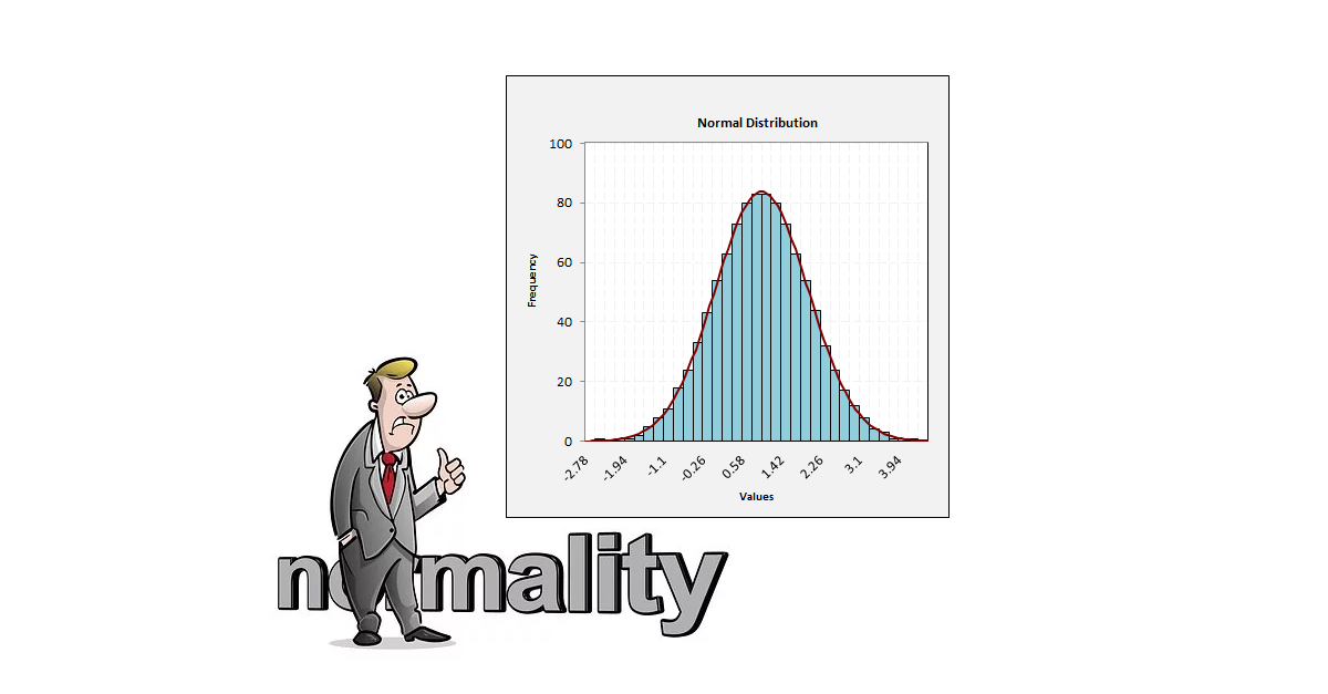
Sometimes we need to determine if the data is normally distributed. A normally distributed data has some special properties that we may want to exploit when we are trying to infer some information about the population from the sampled data. If we assume that the data is normally distributed, when in fact it is not, we may be drawing the wrong conclusions. If we assume that the data is not normally distributed, we would not be able to apply some of the powerful statistical tests since we violate some of the assumptions of those tests. Some examples of tests that require normal distribution are if we wanted to plot the I-MR control chart (Individual Value-Moving average), when we are comparing two sets of data to determine if there are any differences in the mean values using the 2-Sample t test, in a regression analysis to ensure that the residuals are normal etc. How do we check if the data is normally distributed?
Graphical Methods
One of the first things we should always do when we collect any data is to plot it to better understand what the data is telling us. In this section, we will discuss the histogram and normal probability plots.Histogram
One possibility is to plot the data on a histogram and check if the shape is approximately a bell curve. In the figures below are a couple of examples of histogram from a normally distributed data. You can see that if the sample size is small (around 10 data points), it sometimes gets difficult to look at the histogram and determine if in fact the data is normally distributed. However, if there are sufficient sample size (greater than 50 data points), then the histogram reasonably closely follows the bell curve.

The following figures show the histogram for a data that does not follow normal distribution for both a small sample size and a large sample size. From these two figures, it can be seen that if there are significant departures from normality, both plots help detect if the data is normal or not.

However, the problem with using the histogram is that the conclusions can be subjective and different people may interpret these plots differently.
Probability Plots
Instead of looking at a histogram, we could also look at the data on a normal probability plot, Percentile-Percentile (P-P) plot or a Quantile-Quantile (Q-Q) plot. In these plots, the blue dots represent the data points and the red line represents the normal distribution. If the blue dots are “close” to the red line, we conclude that the data is normally distributed. The probability plots make it easier to check if the data is normal because you are comparing the data points to a straight line and we could use a “fat-pencil” test to determine if the data is normal. Figures below show an example of the probability plot for normally distributed data with 10 data points and 50 data points. Since the data points are close to the normal line, we can conclude that the data is normally distributed. Note that if we have a greater number of data points, the conclusions are clearer.

The following figures show the probability plot for a non-normally distributed data. Even though the probability plot with fewer points is pointing to the data being non-normal, the conclusions are more clear if we have sufficient number of data points.

The probability plots are slightly better than a histogram to judge normality since we are comparing the data points to a straight line. However, this comparison could also be subjective. Even though graphical methods are subjective, regardless as a first step we should always plot data to see if the data is normally distributed. Let’s next look at a statistical way of determining if the data points are normally distributed.
Statistical Methods
In order to overcome the limitation of subjectivity, we will discuss three statistical tests we can use to determine if a data is normally distributed.Kolmogorov-Smirnov Test
The Kolmogorov-Smirnov test is a non-parametric test and was developed by Andrey Kolmogorov and Nikolai Smirnov. It calculates a D statistic which is the distance between the empirical distribution function of the sample and the cumulative distribution function of the reference distribution. It is sensitive to differences in both the location and shape of the distribution function. The D statistic is calculated as follows:

If the samples come from the given distribution, then D converges to 0 as n goes to infinity. This value can also be converted into a P value to determine if the data follows a normal distribution. The K-S test statistic does not depend on the underlying cumulative distribution function being tested. It can be used with small sample sizes. However, it applies only to continuous distributions and requires that you know the location, scale and shape parameters. It tends to be more sensitive near the center of the distribution than at the tails. The K-S test is less powerful for testing normality than the S-W test or the A-D test.
Anderson-Darling Test
The Anderson-Darling test was developed by Theodore Anderson and Donald Darling in 1952. It calculates the A statistic which is the weighted average distance between the hypothesized distribution and the empirical sample cumulative distribution function. The weighting places more importance on observations in the tails of the distribution. The A statistic is calculated as:

Where, n is the number of data points and F is the cumulative distribution function. If both the variance and the mean values are unknown, then a modified test statistic is calculated as follows:

The test statistic can be compared against critical values of the theoretical distribution. These can also be translated into P values to check if we accept or reject the null hypothesis that the data is normally distributed.
Shapiro-Wilk Test
The Shapiro-Wilk test was developed by Samuel Shapiro and Martin Wilk in 1965. It calculates a W statistic that tests whether a random sample comes from a normal distribution. The W statistic is calculated as:

Where x_i are the ordered sample values from smallest to largest and the coefficients a_i are constants generated from the mean, variance and covariance of the order statistics of a sample of size n. Small values of W are evidence of departure from normality. This test has done relatively well compared to other goodness of fit tests. The W values can also be translated into probability values (P values). The benefit of calculating the P value is that we can compare this to the threshold value of 0.05 to determine if the data is normally distributed. For all of these tests, the null hypothesis is that the data is normally distributed, and the alternative hypothesis is that the data is not normally distributed. Hence, if the P value is low, we reject the null hypothesis to conclude that the data is not normally distributed. The S-W test is known not to work well in samples with many identical values.
Example
We take an example of normally distributed data and non-normally distributed data to determine the P values using each of the above tests. At a 95% confidence level, we would conclude that the data is not normal if the P value is less than 0.05 and that it is normal (or more precisely no reason to believe it is not non-normal) if the P value is greater than 0.05. From these values, it can be seen that when the data is normal, all the tests perform relatively well except for the resolution of the K-S P values. When the data is not normal, for small sample sizes, none of the tests are able to detect this adequately and reject the null hypothesis. For larger samples, all tests work well except for the resolution of the K-S test.| P Values | K-S Test | A-D Test | S-W Test |
|---|---|---|---|
| Normal (10 pts) | > 0.20 | 0.26 | 0.28 |
| Normal (50 pts) | > 0.20 | 1.0 | > 0.99 |
| Non-normal (10 pts) | 0.15 - 0.20 | 0.098 | 0.086 |
| Non-normal (50 pts) | < 0.01/td> | < 0.001 | < 0.01 |
Summary
In summary, normality checking is required to ensure that assumptions are being met for some of the statistical analysis being performed. If the sample size is large, usually the central limit theorem applies, and normality checking may not be required. Hence, normality checking is more important when the sample sizes are small.We discussed two approaches to checking normality, the graphical methods and the statistical methods. The graphical methods should always be used to get a visual indication of normality, but these could often be subjective and can be a point of contention. Hence, statistical methods are required to provide a more definitive answer to the question if my data set is normal. Unfortunately, all the statistical methods discussed don’t work very well when the sample sizes are small. The statistical tests require a decent sample size (at least 15) in order to work properly.
It is rather ironic that the time we want statistical methods to work properly for checking normality is where they are the least powerful.
Reference
All the charts and statistical analysis reported in this article were obtained from the Sigma Magic software.Follow us on LinkedIn to get the latest posts & updates.
