Blogs
Sign-up to receive the latest articles related to the area of business excellence.
Scatter Plot
View All Blogs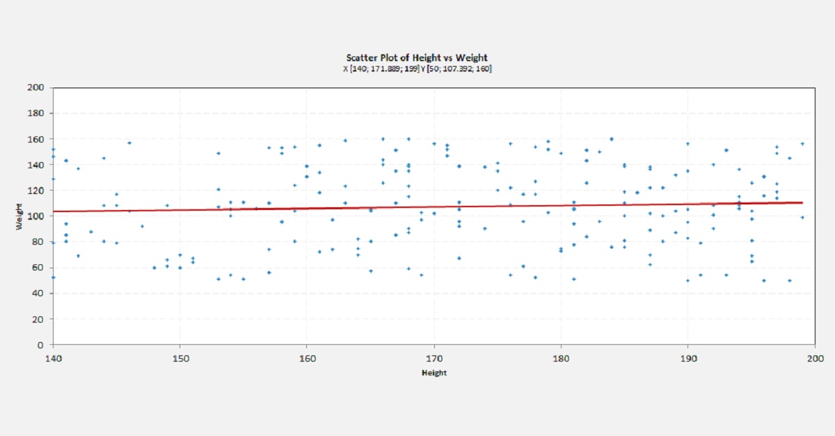
A scatter plot is used to visually determine if there is any relationship between two variables (say X and Y). This plot is usually used between two continuous variables. However, a scatter plot can also be drawn if the variables are not truly continuous – for example the variable may be discrete ordinal data but more than 2 categories. A scatter plot is a visual way of looking for relationship and thus may be subjective. If a more objective way of establishing a relationship is required then we can use some statistical tool like Regression analysis.
Data Collection
In order to plot a scatter plot, we need to collect the data in pairs. For example, let’s say we want to determine if there is a relationship between the electricity consumption in a city and its population. The electricity consumption is measured in KWH which is continuous data while the population is not truly continuous but can be approximated as continuous since there are a lot of possible values. In order to collect the data for this analysis, we may choose for example 20 different cities – determine the population for each of these cities along with their power consumptions for the given period (say a month).Creating the Plot
In order to plot the scatter plot, we would plot one variable (say population) also called the explanatory variable on the horizontal or the X axis and the described variables (say power consumption) on the vertical or the Y axis. Each data point on the scatter plot would indicate one city. We would not explicitly identify the names of the cities as they are incidental to our analysis. Of course we can show then as well if we liked by adding labels.A scatter plot can also be created by grouping the data. For example, we can identify some cities as belonging to a developing nation and some cities as belonging to an advanced nation. We can then plot each group in a different color to see if the relationship between these two variables are similar for the different groups. We can identify the relationship between groups.
Analysis
If there is no relationship between the two variables, then we would find that the scatter plot would be randomly distributed across the X-Y space with no apparent pattern. If there was a linear relationship between the two variables, then we would find that the scatter plot individual values or dots would fall pretty close to a straight line. The slope of the line could be positive or negative. A positive slope would indicate that as the population increases the energy consumption also increases. A negative slope would indicate otherwise (which is not what we would expect for this example). An example scatter plot is shown in the figure above.However, depending on the type of data we are analyzing we could find either slope. In some cases the same set of variables may have both positive or negative slope depending on the situation. For example, if we are measuring the height of a group of people and relate it to age – it may have a positive slope for all data collected among the younger population (say between 5-15 years of age) while it may have no correlation if we collect data for the adult population (say between 25-40 years of age) and it may have a negative slope if we measure for the older population (say between 50-70 years of age due to factors like bone loss, osteoporosis etc.)
Follow us on LinkedIn to get the latest posts & updates.
