Blogs
Sign-up to receive the latest articles related to the area of business excellence.
Timeseries Plot
View All Blogs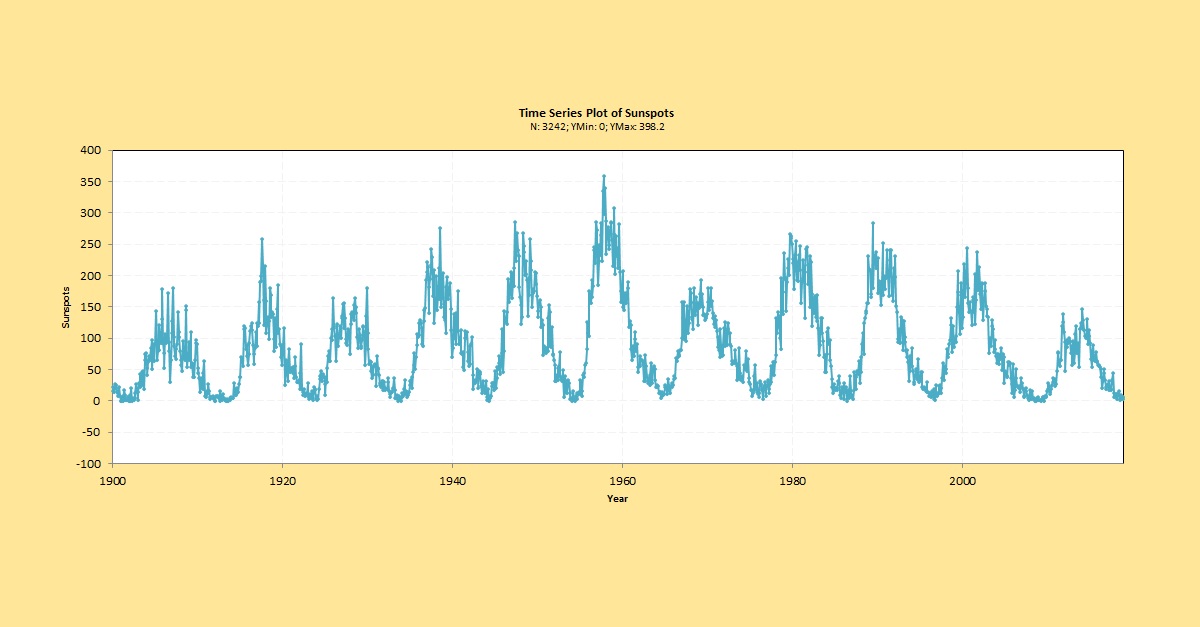
What is a Time Series Plot?
A time series plot is a graph that displays data collected in a time sequence from any process. The chart can be used to determine how the data is trending over time and if the data points are random or exhibit any pattern. For example, you may want to determine whether the number of calls received in a call center is consistent month over month or if there is any specific pattern in the data – such as a decreasing trend, increasing trend. You can also use a times series plot to determine if a process is stable by visually looking for clues about stability.A time series plot requires that the data be collected in a time sequence or order – for example data collected every hour, every shift, every day, every week, every month etc. This means that when the data is stored for analysis, the second data point occurs after the first, the third data point occurs after the second and so on. If the data is not collected or stored in a time sequence then a time series plot cannot be plotted. Theoretically, it is possible that the interval between the data points is not constant but this is usually the case so for all practical purposes let’s assume that the data collection frequency is constant.
How to interpret a Time Series Plot?
The time series plot provides a number of clues about the process.- Determine what are the minimum and maximum values and when in time the minimum and maximum values occur
- Some visual statistics of the data such as the mean of the data values, the mode (most frequently occurring value), the median value (roughly have the values lie less than this number)
- Whether the process is consistent over time or changing from time period to time period. Consistency could be either that the mean is changing or the variation is changing
- If there is any pattern in the data such as clustering – most of the data points are stuck close to a value and is not randomly spread out. This may be due to mixing of data from different processes
- If the process contains any outliers? Outliers are large values (either minimum or maximum) that are much far away from the rest of the data points.
- Is the data collection process reliable? The graph is only as good as the data that is used to plot the graph. Make sure that you have good data before you plot the data.
- Understand how the data was manipulated for the plot. Were any outliers in the data deleted prior to the plot? Was some data points excluded (say for certain departments)?
- Is your data representative of the process? For example, if your data exhibits seasonal variation every year (say the sales are high during the year end every year) then the data you collect to interpret the process should be large enough to understand this seasonality. If you only collect 1 month of data it may not reveal this pattern.
- Have you plotted the data to the right scale? The scaling of the axis is very important. You can have a very large scale on the Y axis and any variation or pattern will be minimized or if the scale is very small, then you may interpret patterns that may be rather insignificant.
Investigating Process Stability
A Time Series plot can be used to determine if a process is stable by visually looking at the time series plot to detect if there are any trends, outliers, or mean shifts present in the data. If any of these are observed, then we can state that the process is probably not stable. Run Charts and Control Charts can also be used to investigate process stability in a statistical way. However, they require additional calculations to plot and interpret the data and should be used when you to have an objective assessment of process stability.Follow us on LinkedIn to get the latest posts & updates.
